This past Monday, Claus Wilke and I announced our package tidyroc.
Very excited to announce my first R package! @ClausWilke and I are developing #tidyroc. You can use it to plot ROC and precision-recall curves, and it is nicely integrated with the #tidyverse's #dplyr, #broom, and #ggplot2. See example in the retweet. https://t.co/duZt69p3tm
— Dariya Sydykova (@dariyasydykova) March 11, 2019
At that point, we had been working on this package for a few weeks, and we were both excited about using it in our class. We teach Computational Biology and Bioinformatics at the University of Texas. The course teaches data wrangling and data visualization using the tidyverse, and it also covers some advanced statistical analyses like logistic regression, principal component analysis (PCA), and k-means clustering. The class following logistic regression models focuses on receiver operating characteristic (ROC) curves. We teach it as a method of evaluating the performance of a logistic regression model. When teaching ROC curves, however, we encountered the problem of not having a proper package or a function to plot ROC curves. All we wanted was a simple function that can calculate true positive and false positive rates and that can be easily integrated with dplyr and ggplot2. Current methods (that we were aware of) either used base R that we basically do not teach, or they used complicated API that requires more code, which can potentially confuse students even more than the ROC curves already do.
Here is the way we invisioned our magical function to work:
library(tidyverse)
library(broom)

glm(am ~ disp,
  family = binomial,
  data = mtcars
) %>% # fit a binary classification model
  augment() %>% # get fitted values
  foo(predictor = .fitted, known_class = am) %>% # foo() is the function we want
  ggplot(aes(x = fpr, y = tpr)) + # plot an ROC curve
  geom_line()
Here, foo() is the function that can take fitted predictors (or probabilites) and true classification and spit out true positive and false positive rates. Those values, then, can be directly passed to ggplot2 and visualized. So after a few conversations and some more research looking into the current ROC-related packages, we decided to write our own package. I took charge on coding and writing up documentation, and Claus provided design ideas and coding advice. I named our package tidyroc, and we developed it to work with ROC and precision-recall curves.
When it was at a point when we could use it for most general cases, we decided to announce it on twitter. The tweet started to gain a lot of traction, and it seemed like we weren’t the only ones frustrated with the lack of a tidyverse-adjacent package for ROC curves. I received a few emails and several twitter responses that shared our excitement and thanked us for the effort.
However, soon after we announced tidyroc, we received an email from Davis Vaughan from RStudio. He informed us about an R package yardstick that does pretty much the same thing tidyroc does. It was developed as part of tidymodels, and it can plot ROC and precision-recall curves. It can also calculate AUC (area under the curve) values and confusion matrices among other things (see documentation).
In light of this discovery, Claus and I have decided we will not be developing tidyroc any further. We believe that it doesn’t benefit the R community to have two packages that do the same thing pretty much the same way. We do not wish to compete with yardstick and would prefer to have a collaborative effort, which Davis Vaughan has proposed to us as well. I may be looking into this opportunity in the future.
I plan to leave the tidyroc github repository as is. If you would like to use it, please be aware that it is not a fully developed package. I haven’t gotten around to writing arguments that would help with handling NA’s (currently tidyroc outputs NA for true positive rate, false positive rate, and positive predictive value if the outcome or the fitted value is NA). If you are planning to use it with glm() and tidyverse’s broom, it should not give you any trouble (glm() by default removes NA’s).
Since there is a simple function to make ROC plots available in yardstick, I am now going to demonstrate how one can use it in their analyses. I will be working with the biopsy dataset that is accessible through the MASS package. This dataset contains information about biopsies of breast cancer tumors for 699 patients.
# load tidyverse and tidymodels packages
library(tidyverse)
library(broom)
library(yardstick)

# load cowplot to change plot theme
library(cowplot)

# get `biopsy` dataset from `MASS`
data(biopsy, package = "MASS")

# change column names from `V1`, `V2`, etc. to informative variable names
colnames(biopsy) <-
  c(
    "ID",
    "clump_thickness",
    "uniform_cell_size",
    "uniform_cell_shape",
    "marg_adhesion",
    "epithelial_cell_size",
    "bare_nuclei",
    "bland_chromatin",
    "normal_nucleoli",
    "mitoses",
    "outcome"
  )
I fit two different logistic regression models. The first model will use clump thickness (clump_thickness), uniformity of cell shape (uniform_cell_shape), marginal adhension (marg_adhesion), bare nuclei (bare_nuclei), bland chromatin (bland_chromatin), and normal nucleoli (normal_nucleoli) to predict whether a tumor is benign or malignant (outcome). The second model will use only clump thickness to predict the tumor type.
# fit a logistic regression model to predict tumor types
glm_out1 <- glm(
  formula = outcome ~ clump_thickness +
    uniform_cell_shape +
    marg_adhesion +
    bare_nuclei +
    bland_chromatin +
    normal_nucleoli,
  family = binomial,
  data = biopsy
) %>%
  augment() %>%
  mutate(model = "m1") # name the model

# fit a different logistic regression model to predict tumor types
glm_out2 <- glm(outcome ~ clump_thickness,
  family = binomial,
  data = biopsy
) %>%
  augment() %>%
  mutate(model = "m2") # name the model

# combine the two datasets to make an ROC curve for each model
glm_out <- bind_rows(glm_out1, glm_out2)
Now that I have fitted predictors, I can make an ROC plot for the two models.1
# plot ROC curves
glm_out %>%
  group_by(model) %>% # group to get individual ROC curve for each model
  roc_curve(event_level = 'second', truth = outcome, .fitted) %>% # get values to plot an ROC curve
  ggplot(
    aes(
      x = 1 - specificity,
      y = sensitivity,
      color = model
    )
  ) + # plot with 2 ROC curves for each model
  geom_line(size = 1.1) +
  geom_abline(slope = 1, intercept = 0, size = 0.4) +
  scale_color_manual(values = c("#48466D", "#3D84A8")) +
  coord_fixed() +
  theme_cowplot()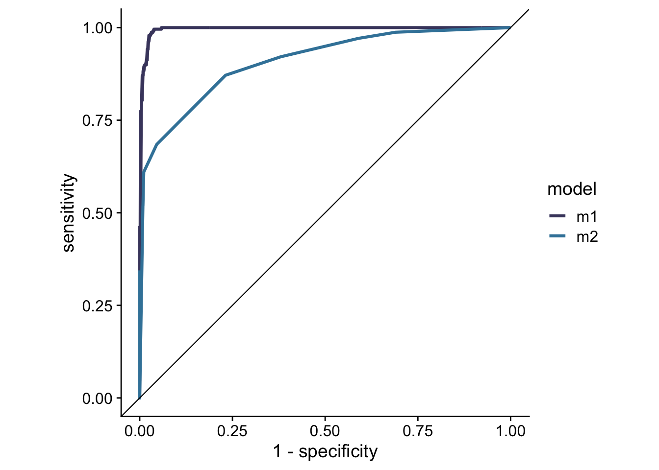
I can also calculate the AUC values for each of the curves.
# calculate AUCs
glm_out %>%
  group_by(model) %>% # group to get individual AUC value for each model
  roc_auc(event_level = 'second', truth = outcome, .fitted)
## # A tibble: 2 x 4
## model .metric .estimator .estimate
## <chr> <chr> <chr> <dbl>
## 1 m1 roc_auc binary 0.996
## 2 m2 roc_auc binary 0.910If you had a chance to take a look at tidyroc’s github page, you can see that I used the biopsy dataset and carried out the same analysis here as I did on the github page. Between the two there are practically no differences in pipelines and in the ways the functions are implemented. I encourage everyone to use yardstick as it is much more developed than tidyroc. It can handle a much wider variety of outputs than tidyroc, and it contains more methods of model evaluation than tidyroc.
In conclusion, I do not regret the time and effort it took me to work on tidyroc. I will admit that I was upset to find out that we weren’t the first ones to come up with this idea; however, I am happy that yardstick exists to help us tidyverse lovers to make ROC and precision-recall curve plots. I am also happy to find out that as a beginner in developing R packages, with Claus’s help, I was able write up an API that is essentially the same as the API written by very experienced coders. I am happy I got to learn some new things too. As a believer in the growth mindset, I like to focus on the things that I have learned and on the ways that I have improved myself. I got to implement devtools, usethis, and roxygen2 and to learn a little more about how these work. I also learned some more about writing tests and about identifying corner cases and writing code for unit tests. I also found many great online sources that I would like to return to in the future. For getting started with writing an R package, Hilary Parker’s blog post Writing an R package from scratch is a great place to start. I also read Hadley Wickham’s R Packages and Advanced R. The first book lays out the different parts of an R package, how these parts fit together, and why are they needed. The second book is great for getting more familiar with R and tidy evaluation.
This blog post was updated on February 18th, 2021. I added
event_level = 'second'to functionsroc_curve()androc_auc()after a recent update toyardstick. This ensures that the class that is positive inglm()is also the class that is positive inroc_curve()androc_auc(). By default,glm()uses the second level of the factor as positive, andyardstickuses the first level. In my coding example,benignis the first level, andmalignantis the second level (usefactor(biopsy$outcome)to see the levels). Therefore, by default,glm()usesmalignantas positive, andyardstickusesbenignas positive. See this github issue for more details.↩